The Present and Future of Mobile SEO & Mobile Marketing
Mobile SEO and mobile marketing topics are in heavy rotation these days and for the past several years industry experts have declared it “the year of mobile.” Even so, many are still not sure how to approach their mobile website strategies.
“Mobile Queen”, Cindy Krum, stopped by DragonSearch before heading to speak at ClickZLive in New York City. She shared her vast knowledge of the industry with usDragons, covering an array of important mobile topics. We are excited to pass the major takeaways on to you.

Cindy Krum, owner of MobileMoxie.
Is Responsive Design the Best Way for Mobile Websites?
One question Cindy gets asked often is whether to create mobile specific content or use responsive design. Google made a big push towards responsive design, saying it is the best approach for mobile. This makes sense for Google because responsive design sites are much less resource intensive to crawl and index. Google can understand m. (m.yoursite.com) sites, but they are double the work for the spiders.
There are strategies for optimizing m. and responsive design sites, but there is not necessarily one correct approach. This is because responsive design has its limitations as well. Cindy firmly believes that responsive design is not automatically the best approach to developing mobile websites. For example, responsive design might not be the way to go if you:
- have mobile specific products and services,
- have a mobile specific experience that is wildly different,
- want to limit the interaction on mobile, or
- want to change the way people interact with you on mobile.
In addition, rich media sites can be especially challenging to design for mobile, particularly when they have been built with less sophisticated technologies. If there are loads of images, animations, flash, or if the site is super interactive, using drag and drop, AJAX and interactive JavaScript, it will be very hard to replicate that experience in a responsive design or on a mobile phone.
Responsive design is not the end-all-be-all solution and we will be seeing different solutions evolve over time.
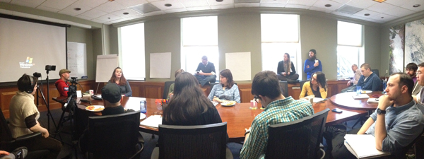
usDragons listening closely to Cindy Krum’s generous knowledge-sharing about mobile SEO.
The Offline World is Becoming Clickable
We can use our mobile phones to interact more and more in the offline world to merge with online usage. Advertisements like QR codes in magazines make the offline world clickable. Unfortunately many companies have slapped these codes on everything without first creating a solid strategy and plan. QR codes that take visitors to a non-mobile optimized home page or an irrelevant landing page are ineffective. In addition, location is often not thought through, like putting QR codes in a subway where there is no mobile signal or on a billboard that gets little foot traffic.
“There is more you can do with the mobile phone if you recognize that it’s moving with the person as they go about their day.” – Cindy Krum
Test, Test, Test Your Mobile Website
Cindy talked about the importance of testing your social plugins and tie-ins on mobile to make sure they function properly. Make sure videos and games play, social buttons go to the right place, and user agent detection and redirection is working properly. Test on both tablets and phones and on both Android and IOS to make sure everything on your website is operational on mobile.
Here is an example: if you are linking to content on Facebook, keep in mind that content cannot be displayed horizontally; the Facebook app forces you into portrait mode. This could be detrimental to what you are trying to convey with your content.
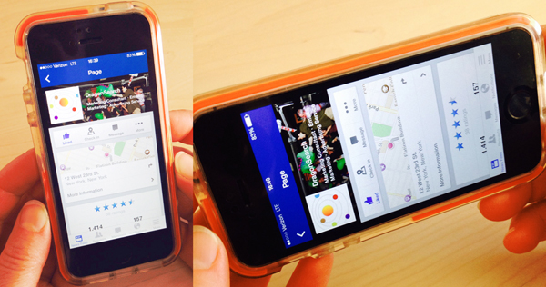
The Facebook app forces you into portrait format; it won’t display in landscape format.
Use the mobile device to test and engage on social; take note of any struggles. Think in terms of the users, both technologically skilled as well as inept ones. If social interaction is difficult on mobile, users will be put off.
Testing Mobile Sites on Emulators vs Devices
Google emulates an iPhone4, which is useful for understanding what Google is seeing, but to understand what users are seeing, it’s best to test on the actual devices. You should test on an iPhones and on multiple Android devices since Android has many handsets and screen sizes.

Cindy talks about her emulator tools and how they can test and evaluate mobile websites.
The MobileMoxie Tools
Cindy has worked with her team over the years to develop a robust mobile tool set. Many of these tools are in the process of being improved and rebuilt. Here is an overview of the tools and what they do.
- Mobile SEO Validation tool evaluates the site on several criteria that are part of a mobile audit: functionality, design, accessibility, optimization, HTML and load time.
- The most popular tool is the Phone Emulator tool where you can chose two phones and preview what the site would look like on those phones.
- Google can detect and will serve different results based on your device. Results may appear in a different order, can include fewer or more videos or images, etc.
- The Search Simulator tool can take a query and show how Google changes the results based on your device.
- The Redirection Script Generator tool generates user agent detection and redirection which is useful if you have an m. site.
- Since Twitter only archives up to 25 tweets, Cindy started caching her favorite Twitter personalities which are now in a searchable database. Her Tweeter search tool only archives tweets with links to news articles.
- Cindy was archiving good mobile marketing examples which are now in a searchable database (soon to become a user generated database). Marketing companies will be able to showcase their mobile campaigns and it will serve as a tool for competitive intelligence.
- Cindy’s team is currently working on developing a new tool that will crawl OG tags, Twitter cards, Schema and Pinterest structured data.

Cindy Krum talking about the Mobile Moxie tool set.
Mobile SEO – Optimizing Mobile Rankings
Mobile Site Architecture Options
There are a few different architecture options you can chose from for mobile: m. sites, responsive design and the newest, dynamic or selective serving. Dynamic is the equivalent of having an m. website with a redirection at the server level, where everything still happens on the desktop URLs, but you are served an entirely different set of HTML. The optimization strategies are slightly different for each of these approaches. Dynamic serving mostly follows the same best practices for responsive design.
Design for Users
Studies show that about 80% of the time, people are within 2 feet of their phone. That includes time they are spending on a desktop or laptop computer, watching TV or driving. For this reason, it would be remiss to approach desktop and mobile with the same strategy. Remember, users want different experiences because they are experiencing different needs depending on the device they are using.
Think about a car insurance company. If you visit their website on a mobile phone, the chance that you were in an accident and need to talk with your agent is high. The chance that you are shopping for auto insurance on your mobile phone is low. The user expects a different and appropriate experience on their mobile device then they would on their desktops.
“Thinking about the mobile web in the exact same way as the desktop web is a mistake.” – Cindy Krum
Bidirectional Tagging with rel=”alternate” and rel=”canoncical”
If you have an m. site, Google wants you to pay the most attention to the mobile pages being linked to the corresponding desktop pages with bidirectional tagging, which is like a meta tag on both pages.
- Add rel=”alternate” to the desktop page and link to the mobile page.
- On the mobile page add rel=”canonical” a link to the desktop page.
Before this solution, the desktop pages were competing with the mobile version of the pages in the mobile search results and would often outrank them. It’s still not a flawless solution and some desktop pages will rank in mobile search.
Google will ignore canonical if they think you made a mistake, like not linking page to page or using a “lump and dump” to send everyone to the top level category or home page. Other concerns and potential problems include: redirect structures, whether the redirects are happening in JavaScript or on a server level and using rel=”canonical” in site maps and on a page level when they don’t match, i.e. if your server has rules like forcing a trailing slash but the canonical doesn’t have a trailing slash.
Skip Redirect
In a skip redirect, the desktop page will rank, but if the bidirectional tagging is not set up correctly, Google will go straight to the redirect and load the mobile page. If this happens your desktop meta data will show in the SERPs even on a mobile phone. For now it seems like a lot of the rankings are based on the desktop page’s content, so it is okay to have less content on the mobile page.
Different Content on the Mobile Version of the Page
Be cautious about having completely different content on the mobile page, i.e you still want the keywords and the targeting to be the same. At this time, Cindy is not seeing any issues or penalties, but she believes things will be changing because the mobile algorithm is constantly in flux and Google has yet to take an official stance on mobile.
Server Tidiness
Server tidiness is critical for mobile. If your server has loose or sloppy rules and will let anything render, it can cause problems with the bots’ crawl efficiency. Some examples include when the server is:
- accepting non-standard capitalizations,
- 404-ing on non-standard capitalizations,
- adding or 404-ing on trailing slash,
- causing dust (duplicate URLs with the same content on the pages issues).
Cleaning up is especially important because when using m. sites, we are doubling the burden of the crawlers.
“Sever rules are easy to change and crawl efficiency has a site wide positive impact so even if you are not using an m. version, it’s good to focus on keeping your server tidy.” – Cindy Krum
Page Speed
The number of DNS requests it takes to render a page is more important on mobile because the site is working on the carrier networks which can slow the load time down and create a bad experience for both the user as well as the crawler. Google gives access to the number of requests in their page speed tools. This means that the algorithm will see this data too; Google does not want to rank pages that result in bad user experience. So combine style sheets and JavaScript, use sprites, and overall reduce the number of round trip requests to the server as much as possible.
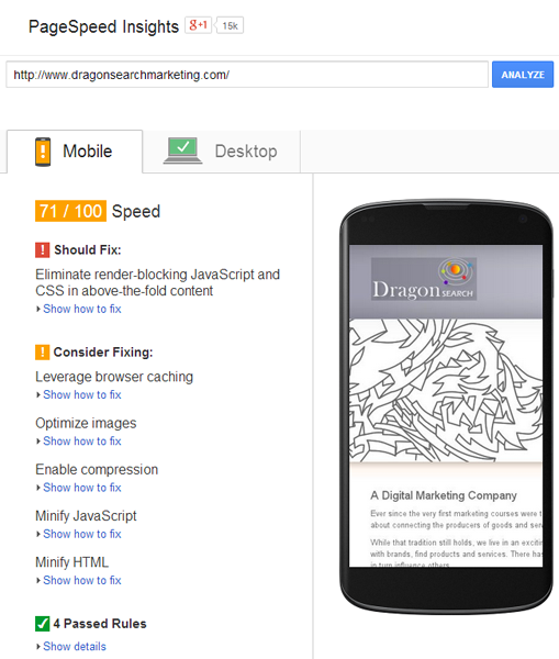
Google PageSpeed Insights results show what you should consider fixing to improve your site’s speed.
Google has a great Google I/O video (watch below) with Brian McQuade, head of the page speed team, which is very telling about what the future of mobile rendering and probably mobile SEO is. Brian says that Google thinks all mobile pages should render in less than 1 second. For most sites currently, it seems near impossible. Google is now changing the recommendations for coding, saying that you should now use inline styles and scripts for content that’s above the fold so that there are no round trip requests for that portion of the site. This makes Google’s job easier, plus results in a better user experience, because while users are looking at the above the fold content, the content below the fold is still rendering.
Our DragonSearch developer, Greg Martinez, added that mod_pagespeed will do a lot of this for you as well: “When it renders the page, it will see what styles are required for that, and on each subsequent load it will inject them.”
However, often out of box tool-sets aren’t good enough for working with some circumstances, like home grown CMSs; there are a lot of opportunities to improve even if mod_pagespeed is in place.
Responsive design will actually be the slowest to load, even slower than regular desktop, which is an additional burden. Working on the page speed is even more important since Google expects our sites to be fast. Proper caching, URLs, all the requests are areas to look into for improvements.
Sensors in Mobile Phones – Exciting Possibilities for the Future with RFID Technology
Mobile phones can interact with off-line sensors. For example, in Japan you can swipe in and out of the subway system and add payments with your phone using the RFID technology. This is the same as when you have to swipe in using badges at a building or a garage. Sensors are low cost, approximately 3 cents, and location sensitive too, so there is no reason not to use them on product packaging, advertisements, etc.
With APIs, like Facebook Connect, users are getting more and more interaction with other apps, allowing the information to go into the cloud and be available on all devices. This allows the user, once considered the gatekeeper, to get out of the way. The value to the user is ease of use, access and convenience, while giving up some privacy of course.
Sensors will play a big role in the future of mobile. Smart homes technology uses sensors that can be set to turn on devices when you arrive home. The benefits of this type of technology is huge and the marketing potential, even greater.
Do You Struggle with Finding the Right Approach to Mobile?
Our mobile devices are quickly becoming an all-in-one device. As they become even more popular, marketers must anticipate the needs of the users to provide the best experiences they can. Share your mobile experiences and struggles or questions below in the comments. Do you have a mobile success story? We’d love to hear about it as well.

usDragons and Cindy “breaking bread” together.